
OPTIVOLT LABS WEBSITE DESIGN
A startup cannot afford to be forgettable.
In a world where hundreds of small but brilliant and innovative teams are trying to make an impression on investors, venture capitalists, potential partners, and consumers, there are few second chances, and first impressions are king. So how does a brilliant startup that has developed a way to fundamentally transform an industry as well-established and firmly-rooted as solar energy stand out against a backdrop of countless websites laden with beautiful product photography and color-heavy layouts?
By leveraging a well-established and firmly-rooted element of of the user experience. The written word.
POINT OF DEPARTURE
Based in San Francisco, Optivolt Labs has been on the cutting edge of solar energy technology for quite a while, developing a PV system that harvests energy more efficiently than anything else on the market while also being much more flexible and light weight than anything the consumer market has seen to date. Their eyes are set strictly forward, into the future, where solar energy powers the world, including everything from tables to scooters to music festivals in the desert.
Such a forward-thinking team of brilliant designers and engineers needs a worthy internet presence. While limited in the amount of visual media they have at their disposal, especially of finished product images, they want to capture the attention and imagination of potential investors and partners that want to help build a sleek, bright, and simple world.
Unfortunately, while the current website offers immense potential, it does not quite capture the aesthetic nor the message Optivolt wants to convey. They want to prove they are unique; they want to prove that they make the rules instead of following existing ones; they want to show that they are bold, audacious, and completely fearless in the face of the unknown.

Optivolt seeks to move away from the "service" platform. This is no longer relevant.
Header wants to be less material and much more broad, far-reaching, and focused on many solar applications instead of only devices.
Generic stock photo strip backgrounds blend Optivolt's website and brand identity into the hundreds of others using the same safe and conservative aesthetic.
Iconography needs to reflect the brand promise of sleekness and simplicity.
Over-abundance of information on the home page risks overwhelming the visitor. Complex information needs to be delivered step by step. Design and layout need to be simplified to reflect this.
Optivolt's applications suffer poor findability, relying on visitors to scroll down the home page several times before they find them.

The heavy color value of the strips weighs down the web page and detracts from the futuristic intent of the brand.
Research shows that investors care even more about the startup team than the product. This section needs to convey far more detail and personality.
There is an opportunity to establish a memorable brand identity in the tone of the headers as well as the way they are style and laid out.
MY ROLE
Optivolt Labs brought me on as a freelance end-to-end UX designer. Coming from outside the startup, I can assess their image and goals with a fresh set of eyes and can become the expert on how to best convey it in website form. While having strong opinions on who the potential visitors to their website would be as well as what the identity of Optivolt Labs actually is, they relied on me as the expert in how to bring that to life and make sure that each potential investor or partner that comes across their website finds what they, specifically, are looking for.
As the sole UX designer for the website, I took ownership of the entire design process, from user research and identifying the intricacies of the primary persona, to organizing the website for maximum findability and usability, to proposing aesthetic schemes, interactivity, and new, unified brand image across the website in wireframes, prototypes, and mockups from the lowest to the highest level of fidelity. I worked closely with the CEO, CTO, and Chief Architect of the startup with weekly design critiques and live, 100% remote design workshops.
Upon the completion and approval of the design, I proceeded to take on a front-end development role in implementing the website. This effort paid special attention to creating a responsive web experience that could scale to any screen size on any device.
A UNIQUE AUDIENCE
Unlike many traditional websites focused on business-to-consumer product delivery, the primary visitors to the Optivolt Labs website would not be the private individuals that would be directly purchasing their product. Instead, Optivolt's entire message is geared towards potential investors, such as angel investors and venture capitalists, as well as technical professionals from larger companies that would seek to partner with Optivolt to bring solar capabilities to their product, which they would then sell to consumers.
After copious research into the mentality of investors and business partners, a stark contrast in the user experience approach to those two personas versus a more typical consumer persona began to materialize:
VENTURE CAPITALISTS BEHAVE THE
EXACT OPPOSITE OF CONSUMERS
While the typical consumer might be considered impulsive and somewhat irrational in their decision making, the primary personas for this website would be quite the opposite. Gone would be the splashy, emotionally evocative product photos, slogans, and sales-focused CTAs. Both venture capitalists and senior technical staff often know exactly what they are looking for when they come to a startup's website, and any efforts to distract or obscure are rewarded far less than efforts to be clear, transparent, and simple.
The first persona is that which is modeled after a venture capitalist and financial powerhouse looking to invest in the startup:

In addition to potential investors, the website also desires to cater to industry professionals representing companies looking to potentially partner with Optivolt on potential projects.

Working with the above mentioned two primary personas and two more secondary personas, it became clear that the website needed to convey the purpose and identity of the startup on the front page while simultaneously making the information regarding the team and each individual application findable and simple to navigate to so that each visitor's unique needs are met as quickly in the user flow as possible.

User flow study for both primary and secondary personas.
BRAVE BY DESIGN
With the goals for the website clear as day, we came across a dilemma: the home page needed to convey the team's mission and values while also being able to, within mere seconds, showcase to the visitor all of the key applications the team was designing for in order to retain any potential technical partners that came across the page. And, all of this needed to occur without the highly dense and overwhelming nature of the existing home page with good usability and findability for other important information such as the Team and Contact pages. The home page, too, had to make a powerful first impression. It could not get lost among other generic designs.
Thus, we decided to take a risk.

A much more complicated and information-dense home page that was rejected in favor of a lighter weight approach.
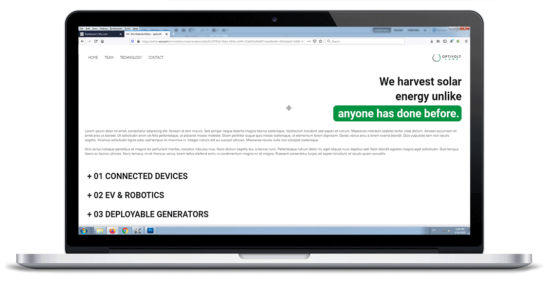
Instead of a more typical, strip-based page like the scheme above, I proposed a brave alternative: the landing screen would be centered around a single sentence of text - huge, bold, and INESCAPABLE. Everything else around it would just be white space, forcing the perspective back to the phrase. To reflect the pain points of Mark's persona, the language would have to be chosen carefully to reflect both the mission and ambition of Optivolt Labs and to be clear, simple, and transparent about what it is they actually do.

An extremely minimal home page scheme with animated text being the only focus was far braver, more memorable, and allowed us to convey the intended message with no distractions.
Committing to this extremely minimalist approach left us with a large deficit - the visibility of everything else on the website gets a downgrade as all other pages are funneled into the navigation bar at the top. This brings us to the needs of Joshua's persona. After all, if we force him to have to navigate to the top bar, hover over the Technology tab and try to find his application there, we might never see him again. In order to meet the goal of catering to both of these personas, there needed to be a way to bring each application front-and-center in one or, better yet, zero clicks.
It was at this point that we discovered a hybrid strategy that would hit two birds with one stone:
COMBINE MISSION AND APPLICATIONS
IN ONE INTERACTIVE BLOCK
What better way to support each mission statement than with a concrete example of an application that supports it? And what better way to attract a technical partner than with a photo of their exact application being the first thing they see on the home page, with a text block they could click on to be taken directly to the detailed overview of said application? It was the best of both worlds and, with an animated text line that would type out one mission statement after another, it introduced a level of charm and interactivity that would hold the visitor's attention for longer.


The home page went through a number of high-fidelity iterations as it would define the graphic language of the rest of the site.

The final home page with animated text relating brand mission to real-life technical applications.
Carrying this theme of using interactivity to help visibility, we approached another challenge, this time on the website's Technology page. By the completion of the design phase, Optivolt had three defined applications of their technology and, given the amount of documentation and exposition present for each, the only one that would be immediately visible to a visitor would be the first one. There rest would have to be scrolled to, a problem that would only get worse and worse as more applications would be added in the future.

With a simple list of applications on the Technology page, every application after the first has poor initial findability.
To resolve this and to ensure greater exposure and findability of all applications, we once again embraced the power of large, bold text and interaction. Instead of all applications being listed in full detail, each would start collapsed under its header when the page is first loaded. Since these headers take up significantly less vertical space than the full sections, they are all visible without any required scrolling and can be opened with a single click.
The result is a clean, purposeful, powerful page that does not overwhelm the visitor with more info than they bargained for. It is one that allows the visitor to choose their own adventure, opting to see only the applications that interest them, instead of being bombarded with information that is not relevant to them.
The interactive Technology page allows visibility of all applications and elicits interaction and participation from the visitor.
OPTIVOLT FOR EVERYONE
The creation of a brand new web page and brand identity is always bound to have an impact on existing design systems and potentially even create new ones, and this was no exception. In addition to a neutral white and dark gray palette, the website uses the Optivolt Labs corporate primary color for the purposes of branding and highlighting key elements of text. Unfortunately, this color choice was not an accessible one, as the white-on-teal palette did not meet either of the WCAG Large Text contrast standards.
This meant that either the highlight colors of the website had to deviate from corporate standards, or that the corporate standards had to change, Optivolt, being an inherently inclusive company, opted for the latter. This served as an opportunity to overhaul the logo colors (with the hue moving towards yellow, value getting darker, and saturation increasing to compensate) as well as the header font and weight.


The corporate primary color and the original H1 font were tweaked slightly to be able to be used as a highlight throughout the website without significantly altering the brand identity's color scheme. This white on green relationship was confined to large text only.
While the primary personas the website was designed for prefer to visit using desktop or laptop computers, we wanted to make sure that anyone could access the site independent of their device type or its screen size. For this purpose, each page was designed with mobile in mind from the very start, with a fluid and responsive grid that changes the number of columns and the width of each column depending on the width and height of the available viewport. This seamlessly translates the experience to any device with no compromises to legibility or aesthetics.


The Optivolt Labs website is optimized to scale for any screen size across three break points.
