
ASK AWAY
At one point or another, all of us have needed to ask an expert.
All of us are without a doubt good at certain things. Some of us are phenomenal artists, experienced developers, or highly skilled chefs. But what happens when we stumble upon an issue that is out of our realm of expertise? What if it is the kind of topic that is too advanced for our friends or relatives to answer or, better yet, what if it is the kind of thing that has so many answers that the untrained eye cannot even begin to separate fact from fiction.
From working through the technicalities of work visas to understanding the scientifically proven best practices to raising our children to the irrigation and drainage layouts for backyard gardens - the Expert app allows us to not only quickly and easily connect with someone to guide us, but to make sure that this someone's instruction and personality is perfectly tailored for speaks to us best.
EXISTING CONDITION
When looking at the existing go-to methods of obtaining information, two totally different methods come to mind. The first leverages the power of sheer numbers of people and the conversation they can generate: Reddit. Many people seek, and often successfully find, advice on Reddit and other forums due to its enormous and diverse community. There is a sub-Reddit for nearly every topic imaginable, and having many active participants means that the advice is free, fast, abundant, and typically comes in a variety of different perspectives.
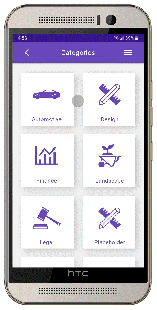
If one would like advice from a certified expert, however, only one prominent competitor exists: JINITTO. This European-based app allows users to contact experts with questions for a fee and speak with them via video call. The app seems to go largely under-utilized, with little recent activity on its blog as well as an absence of documented calls.

FAQ page opens in the web browser, not in the app.
None of the closed FAQ questions actually open.

The app's USABILITY starts off on the right foot by presenting the user with a brief series of onboarding/tutorial screens (also, rejoice at the presence of the “Skip” function!), following up with a clear and easy to understand home menu. However, when one starts to get into the “extras” is where it all falls apart. The FAQ page, for example, takes the user out of the app and to a web page and does not actually show the collapsed questions.
The NAVIGATION of the app suffers from a simultaneous redundancy and inconsistency. The home screen features both a hamburger menu and a strip at the bottom of the screen, and the functions present in each are identical.
Furthermore, as one explores deeper into the app, the hamburger menu at the top disappears, creating an inconsistent and frustrating experience. If one wants to access one of the functions that is present in the hamburger menu and not in the strip, they have to back all the way out to the home screen.
Hamburger menu at the top AND a flat hierarchy strip at the bottom.


What is the difference between paid advice and free advice?
Hamburger menu missing.
Jinitto has no trouble differentiating from its competitors because its competitors are few and far between. It is the only app that allows users that need advice on a broad variety of topics to have live video calls with experts and pays said experts for their time.
That said, based on the lack of reviews and calls answered by experts in recent months, this app seems very underused. It might be the over-reliance on video calling instead of text, an absence of diagramming tools, or the identity crisis of its interface between blue and mustard yellow pallettes. Or perhaps, in seeking variety, they are competing against the wrong markets. After all, if someone goes to a gym and needs advice on workouts or weight loss, they have personal trainers there at the gym to answer them - they don’t need an app.
However, with an approach that leverages refined UX, expanded in-call and match-making functionality, and a highly curated array of question topics, the ASK AWAY app seeks to succeed where Jinitto could not.
PROBLEM STATEMENTS
The novice users need a place to ask a wide variety of questions and get prompt answers from credible experts that match their personality preferences because they want a welcoming experience and confidence in the advice they are given. We will know this to be true when user ratings of their interactions with experts from a breadth of different fields all achieve a value above 4 of 5 stars.
The expert users need a way to quickly find questions to answer and get reliably paid for answering them because their time is valuable and they should be rewarded for their effort. We will know this to be true when experts stay active and continue to return to the app on a regular basis to answer questions.
MY ROLE
With the ASK AWAY app I performed all research and design roles from start to finish. My work on this project spanned from a user research and content definition phase, to information architecture, to wireframing and prototyping, to usability testing and documenting the design system, as well as many other smaller tasks in between.
My work was made possible through the time and effort of countless people who volunteered to participate in the user research, card sorting, and usability exercises that helped give the app direction and evaluate design decisions.
TWO SIDES TO THE COIN
The particularly exciting thing about creating a product such as Expert is the fact that there are two distinctly different groups of users: the "Askers" who ask the questions and the "Experts" who answer them. While in simple terms, the two groups are after the same goal - to get questions answered - they differ greatly in approach, preferences, and pain points, which means that all aspects of the app's design must carefully cater to personas in both groups.
To get a realistic understanding of the needs of each user group, it was time to ask some questions of our own.
RESEARCH GOALS
Determine what will motivate/incentivize Askers and experts to actually use this kind of an app over alternatives like forums, Reddit, etc, and use it more often than they perhaps would otherwise.
Get a better understanding of the kinds of things people would most likely be asking about – not all topics/subjects lend themselves well to paid online consultation with strangers.
Figure out the kinds of environments that people will most often use this app in, be it more hectic and on-the-go (spontaneous questions) or in a more controlled environment (premeditated questions).

After conducting in-person interviews with three volunteers fitting the Asker profile and two that fit the Expert mold, several insights became apparent.
▪ People trust a real human being that they can see and speak to as opposed to anonymous usernames on the web.
▪ While there is plenty of information everywhere, the key advantage of having an expert is their ability to adapt their advice to the asker’s specific situation.
▪ Askers value their time and want clear answers quickly, and having simple instructions makes it easier to act on them.
▪ Being on-call is seen as more stressful for the experts, putting more emphasis on reserving calls ahead of time.
▪ Askers prefer to feel in control over how long it takes to get advice, so an "Urgent" call function is desired.
▪ Being able to draw as you explain helps eliminate confusion and miscommunication, and often saves time compared to explaining only verbally.
The insights gained in turn spawned three different design personas, with two representing different Askers that might use the app while the third symbolized the nature of an Expert.


SAME FLOW, DIFFERENT WORLDS
There were several processes that emerged from the exploration of the design personas and their user stories. Since they were essential to the users achieving their goals, these processes became the foundation of the app's functionality. They revolve around scheduling calls, getting matched with experts, and being able to use the provided visual diagramming tools to improve and speed up communication.
To better understand how these processes would be structured, we first isolated them and considered each persona's idealized flow through their most essential process.
User Flow: Scheduling a Call

User Flow: Choosing an Expert

User Flow: Using the Canvas

It became immediately clear that the Askers and Experts both would be using some of the same functions in order to achieve their goals. Both would be taking part in the scheduling of a call, both would have schedules, and both would be able to use the visual diagramming tools to better communicate their point during a call.
What was a more surprising discovery, however, was the fact that due to the differences in their priorities, preferences, and needs, the Askers and Experts would actually be using these processes differently, and potentially in different order. Therefore, while the functionality is fairly similar, the flows of the Asker and Expert worlds differ greatly and begin to suggest a hierarchical system where these different experiences form the primary branches.
From this realization, the first version of the site map was born, with the Asker and Expert trees distinctly separate, but still closely resembling one another.

Nothing is perfect off the first try, however, so we immediately set out to evaluate the assumptions made in the sitemap against the mental models of typical potential users. We did this with an open digital card sort that asked participants to categorize a set of terms derived almost completely from the Asker side of the site map. Thanks to the similarities between the two sides, the lessons learned would be applied to both.

A card sort response with fewer categories.

A card sort response with a greater number of categories.
Note how Notifications, My Calendar, and Settings are all separate categories, compared to Account in the previous example. However, expert profiles, matchmaking, and expert submissions remain fairly consistent groupings across both.
Looking over all of the responses, the most frequent repetition occurred with the Submit Question options/screens being placed in the same category as the Select Question Category option. This confirmed the link between these steps as part of the process for asking a question. Similarly, the Expert’s profile and calendar were grouped with the head-to-head comparison and expert filters, meaning the expert selection could stay as one unified process. However, it clearly wanted to be less of a sequential process, and rather one with a flatter hierarchy.

Notifications seem to belong more closely to a ‘profile’ rather than ‘call schedule’ category.
In-call communication methods and drawing tools are naturally associated with the call itself.
Calls and follow-ups relate strongly to the expert’s calendar.
Matchmaking and asking the question are not seen as closely related.
The above similarity matrix shows the percentage of responses in which each pair of terms were clustered together.

This 'best merge method' dendogram takes clustering a step further and creates hierarchical branches out of the most commonly clustered items.
One of the most substantial insights offered by the card sort was the strict separation of the question category selection and the submission of the question from the rest of the call setup/scheduling process. This meant that separating the two halves of the former with the entirety of the latter would not be a good choice.
Additionally, there was a strong connection between the creation of calls and follow-ups, as well as the viewing of details, being executed from a calendar view. This, combined with the flat hierarchy notion from the previous page, created the possibility that the Asker’s and Expert’s calendars would become the screens from which all of the other processes could then be accessed.
Having absorbed all of these valuable insights, the site map began to look a little different. As a testament to the value of iteration within every step of the design process, many of the corrections picked up for the second version of the map became the cornerstones of the app's design and layout.

LAYING OUT THE CORNERSTONES

With a more refined sitemap in place, it was finally time to get messy with the way the app was going to look and feel. While creating clean and simple apps and websites may be a contemporary standard - perhaps even a cliche - but it became particularly important with the expert app for one crucial reason. People will not be using this app "recreationally", per se. Askers will likely be in a hurry to get their information or anxious about whether there is anyone out there that can help them, while Experts are spending their free time to help others and earn a bit of cash on the side, which means the quicker they get to doing what they came to do, the better.
Therefore, a single extra click or a single extra second to find information can truly be the straw that breaks the camel's back.
In a screen space with lots of information to deliver, then, it becomes that much more important to choose what is shown when, and how quickly one can navigate to it, compare it against other information, and so on.
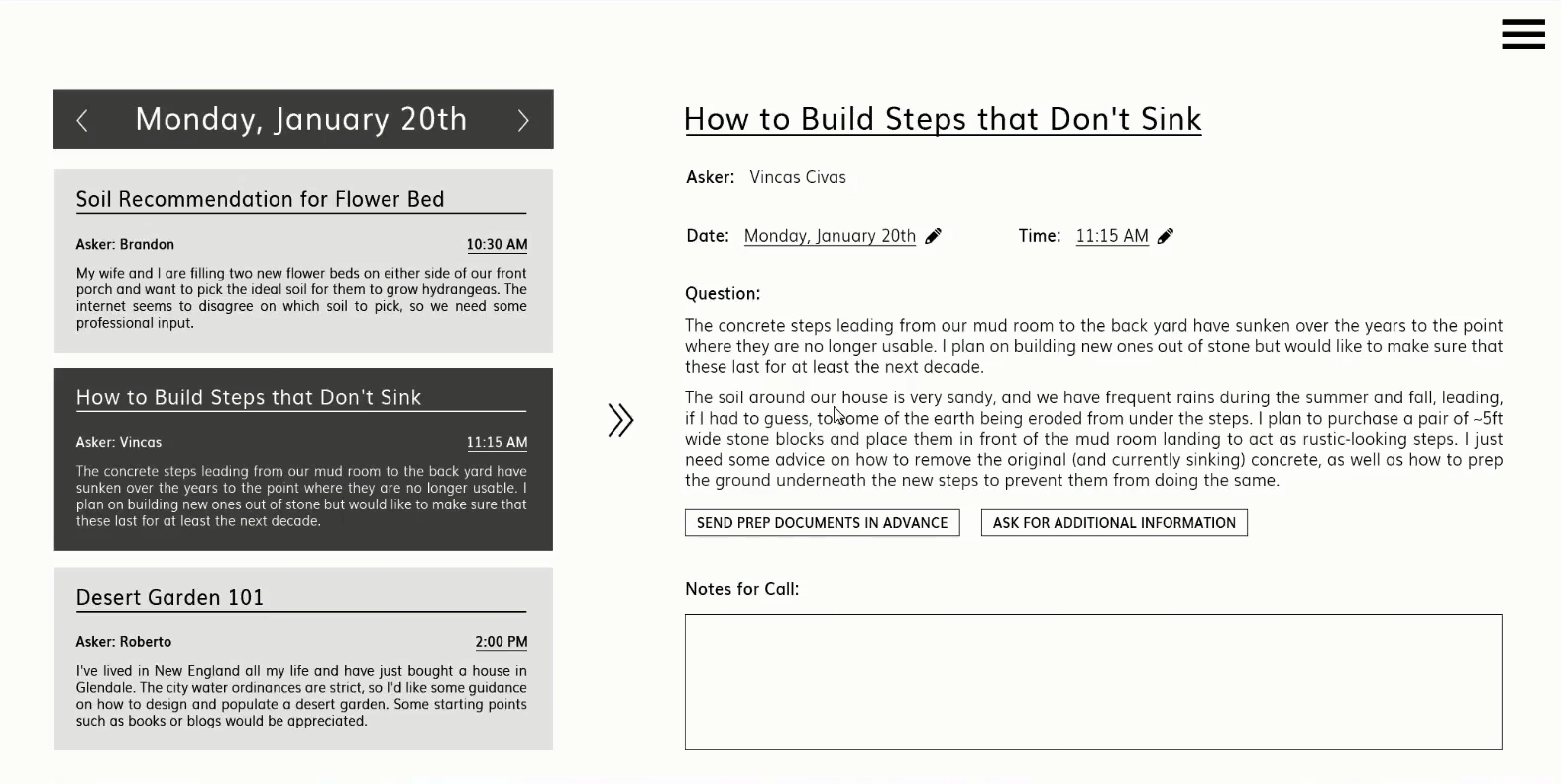
Back arrow takes the asker back to the overviews of all experts within the selected category.
Tags, which help with searching as well as getting a quick overview of an expert's qualities and specializations.
List of verified degrees, certifications, and relevant experience.

Page name displayed at the top to help users always know where they are.
The options to add the expert to your list of favorites and to see their calendar, as well as go to their reviews, is located on the right side of the screen to be easily accessible by using the thumb when holding the phone with one’s right hand.
The expert’s written bio - the page can be scrolled vertically to reveal more.
The app was designed using a mobile-first strategy to not only cater to the primary Asker persona of Claudia, but to also promote simplicity on the Desktop platform as well. Due to the limited screen space on mobile, particularly information-heavy pages, such as Expert profiles and scheduled call info pages were split into an Overview Page and a Detail Page. This allows the user to get a quick overview of available experts, for instance, without being blinded with paragraphs of information, and to dive deeper only when they area ready, easing anxiety and stress.
Furthermore, the layout of various elements, such as the functions for viewing an expert's calendar or adding them to one's list of favorites, is driven by mobile ergonomics: key clickable items go on the right to make it easier to tap them with the thumb of the right hand.


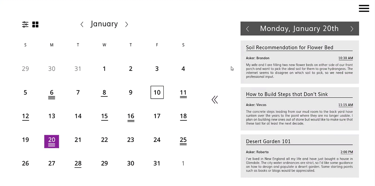
The difference in layout for desktop and mobile. While the mobile is hyper-simplified to allow the screen real estate to be entirely focused on the call overviews, the desktop version takes advantage of the extra space and includes an interactive calendar showing other days with scheduled calls.
With the minimalist mobile-first design serving as the "clean slate", the desktop version of each function, then could be infused with a greater array of functionality. The Call and Canvas windows, for instance, gain a wealth of extra features, such as expanded drawing tools, call notes, and even a chat feature to send links and complicated names of plant species or equipment models that are hard to pronounce. This is, however, not done just to fill extra space. Much of this extra functionality fills the needs of Rahul's Expert persona, and his key preference is to use the desktop version of the app to manage and take his calls.
It is a match made in heaven.
1
2
3
4
1
2
3
4

Given the greater size of the desktop screen space, a section for note taking is integrated into the call screen.
The desktop version gets an even greater array of tools, such as taking screenshots or timing the call.
The video can either nest in with the other elements or can be expanded to full screen mode.
The text chat feature supplements the video call by allowing the asker and expert to send each other things like links or other info that is best conveyed in text.

All of the simplification and separation of content into multiple sequential screens created another sizable issue, however: it was taking too many clicks to get anywhere. The greatest point of friction occurred when one needed to quickly browse from one Details level page to another. Be it navigating from one call's info to another's or from one expert's details to the next, the user would have to go back to the overview screen, and select another expert - one click too many.
To remedy this, each detail screen was split in two. The right part displayed the detail page, while the left acted like a condensed version of the previous overview screen. This enabled users to switch from one detail screen to another in one click. Should a user desire to see the overviews in full, they can click on the dividing bar to go back. All of this was finished with a smooth left-right sliding interaction to reinforce intuitive wayfinding. Like a spatial version of breadcrumbs!
A WORD ABOUT ONBOARDING
The design of the ASK AWAY app commits to taking several risks: it utilizes a handful of navigation mechanics that may not be immediately intuitive to users from past experience for the sake of faster and easier user flows, and offers features, such as Head-to-Head expert comparisons and Canvas sketching functionality, that first time users may not be familiar with. These are the mechanics that need to be explained.
The crucial factor in deciding on which onboarding method to use is the fact that often times, people seeking help or advice are doing so in a hurry. They are anxious to be able to do at least something to alleviate the situation and make some progress with whatever challenge they are facing. For this reason, a swipe-through tutorial was eliminated immediately, since it would likely get skipped through - and cause a lot of undue frustration - more often than not.
Instead, the app uses a combination of coach marks and progressive pop-ups, with the former being used to define the purpose of entire pages while the latter typically describes a single function. These allow the user to make steady progress on getting their advice while only having to learn what is essential for the specific screen they find themselves on.

TESTING THE WATERS
Armed with the first mid-fidelity prototypes, it was time to put the execution of the underlying concepts of the app to the test. As a tireless advocate for iterative design, the moment something gets drawn, animated, or exported, I am already itching to find someone to test it. Be it impromptu guerilla testing around the office or rapidly organized same-day online preference tests, testing a prototype in its earliest of stages can validate or steer the design direction and save tons of time down the road.
For the purposes of testing the ASK AWAY app, I conducted six in-person moderated usability tests for the more complex and holistic aspects of the app such as navigation and findablity of elements as well as a number of online preference tests for more visual and UI-focused questions.

One of the biggest objectives of the usability test revolved around verifying whether or not the left-right sliding navigation system would, in fact, be learnable and intuitive without a significant amount of on-boarding. While the navigation did help testers create a subconscious spatial map of each flow in their head, the navigational system was nearly undermined by something as simple as the arrows. 5 of the 6 testers were initially confused by the agency of the arrows meant to slide them back to the previous "page" because they pointed where the UI elements, and not the users, were moving to.
BEFORE: In the first version of the Calendar prototype, the arrows to slide from page to page pointed in the direction the elements would move, which is the opposite of the direction we, the users, would be moving in relation to them. This generated a lot of confusion.
AFTER: After hearing from the users, the direction of the arrows was reversed and the backwards transition from page to page became much more intuitive. Better yet, testers were much quicker to try them out and discover what they were for!

Having sorted out an essential aspect of the navigation, it was time to look at the interactivity of another hugely important element: the Head to Head comparison. The Head-to-Head allows Askers to compare Expert profiles side by side without having to flip from one page to another. Simply add up to four Experts and compare their attributes, such as rating, price and so on. The original method of adding experts to the Head-to-Head involved clicking on their name from the list on the left, but 67% of first attempts to add an Expert involved trying to click and drag a name from the list to the comparison. It became evident that this was the preferred method, so that functionality was introduced, along with the ability to expand an Expert's name and see a brief overview to know who you are adding.
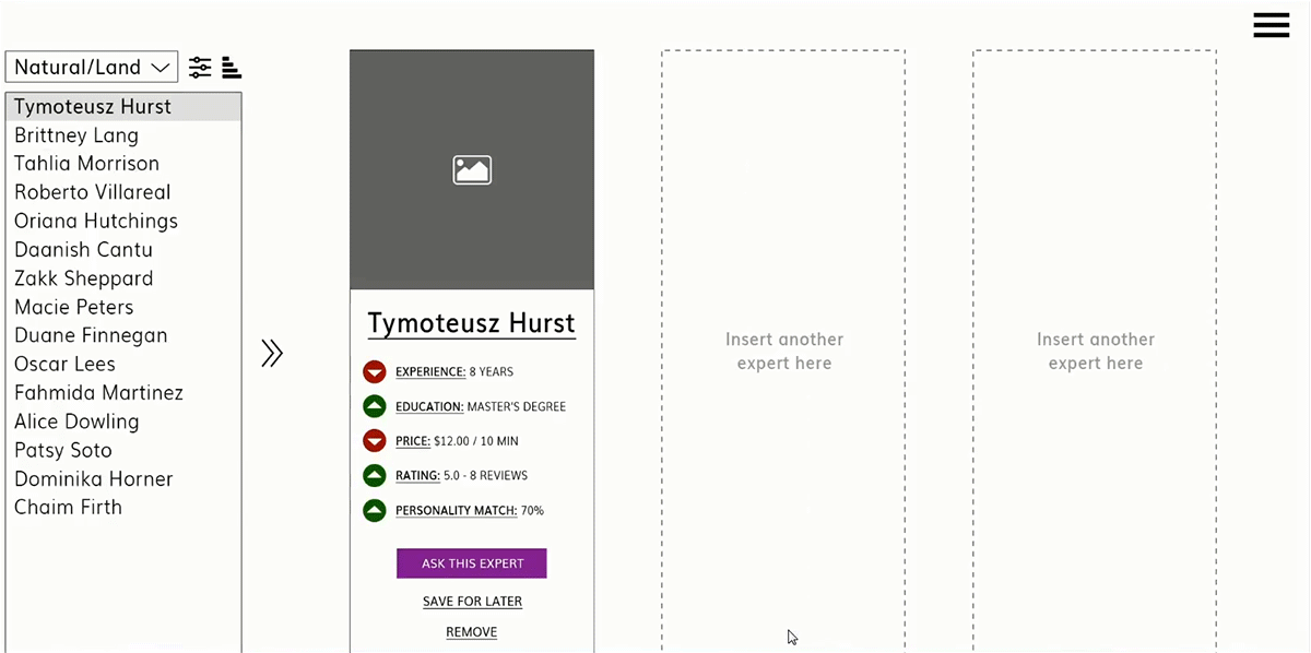
BEFORE: While the assumption for the initial clickable prototype was that Askers would simply click on names in the list of experts since it was faster, the more intuitive interaction for the majority of testers was to click the name and drag it to an empty Expert card slot in the Head-to-Head.
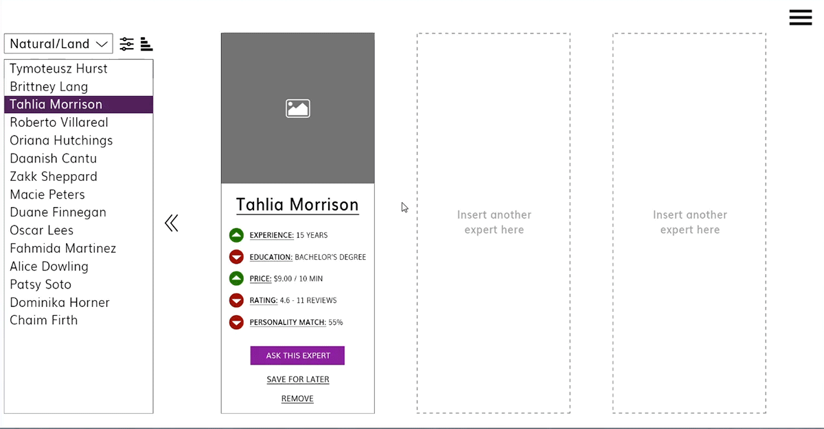
AFTER: In addition to the click-and-drag, the option to expand an Expert's name to reveal basic information was essential. Since Askers wouldn't have all Experts memorized by name, it was essential to get an overview of who they were adding to the comparison without leaving the screen. Thanks to the feature, Askers can be more knowledgeable about who they add, and the experience stays localized to one screen as intended.
In addition to keeping track of each tester's first attempts of every task, task success rate, and general comments and observations, the performance of the prototype was evaluated using a SUS satisfaction score. Each participant was asked to complete a survey after testing the prototype which asked them to rate the ease of use, complexity, clarity, and consistency of their experience. With scores ranging from 53 to 95 and an average sitting at 80 points out of 100, the prototype validated many of the design drivers that had been determined overall. With the revisions mentioned above as well as a number of lesser tweaks addressing the pain points belonging to the lower scores, it is expected that this number will continue to rise.

Prototype Satisfaction Score (out of 100)
Unlike the moderated usability tests which focused on navigation and interaction, testing the waters for the visual language and attitude of the app's web homepage required a more quantitative approach. Since the majority of users would likely do some research on the app online before committing to downloading it, more often than not the homepage would act as ASK AWAY's introduction and elevator pitch to the potential user. Much of the required content was self-evident, but the attitude and intended audience of the homepage was still up for debate.
On one hand, the page could be geared towards both prospective Asker and Experts with a CTA that visibly catered to either and could be used as a springboard for account creation. The alternative was a page with a more agnostic, bright, and central CTA that avoided requesting any information, inviting visitors to explore instead. This approach traded immediate conversions for a friendlier attitude and leveraged the exploration of the app's features and content as an account creation vehicle.
The preference test was carried out online with 16 volunteers representing the demographics of Asker and Expert personas.


The single-CTA mock up was a much more popular choice among the preference test volunteers. While the account creation CTA was labeled as "in-your-face" and "intimidating", the bright yellow CTA offered a way to encourage a visitor to sign up while hiding the data entry fields and relegating them to a different page. Despite its diminutive size, the secondary "explore as a guest" CTA also played a huge role in winning over the majority of test volunteers, with many praising the ability to learn more about the app without handing over one's information.
Having benefited from being tested early in its design when all of its elements were still flexible and the content only partially developed, the landing page was able to absorb even minor critique without sinking substantial time into re-design. The the full landing page took on the exploratory and slightly Asker-biased attitude with the certainty that this choice was backed by the overwhelming majority of participants from the first preference test.

The full desktop web landing page for ASK AWAY.
THE FINISHING TOUCHES
Having gone on the journey from concept, to user research, to low- and mid-fidelity wireframes and prototypes, to usability and preference testing, it was now finally time to take the ASK AWAY app to the maximum level of detail. The pixel-perfect design of the app roots itself in Google's Material Design, with most visual elements being shared between the mobile and desktop versions. The app leverages many Material Design guidelines - density-independent spacing, typography, color and tonality, and lighting and shadow, to name a few - to create an appealing, clear, and consistent experience.

Mobile layout wireframe

Grid applied to high fidelity prototype

Pixel-perfect mockup
The visual aesthetic of the app went through a number of iterations to strike a balance between being visually compelling and having that "pop" without weighing the interface down with an overload of color or mass. Having tried techniques that lean on strokes and borders, color inversions, and different ratios of primary and secondary colors, the final design leaned aggressively into the concept of light and shadow instead.
In addition to using three shades of the primary violet color and a single shade of a secondary highlight (present as stroke and fill to emphasize suggested experts over others, for example), it fills the rest of the screen with a selection of three neutral colors - a light gray for a background, a white for floating surface elements, and a dark gray for text. The addition of a highly diffused, soft, and light colored shadow beneath floating foreground elements helps create a strong sense of separation between various cards and their background without overbearing strokes or bright colors.


Preliminary desktop high fidelity iterations.

Pixel-perfect desktop mockup.
The overall read of the app strives for a certain level of neutrality that seeks to get users to where they are going quickly and with minimal interference, punctuated occasionally by one of a number of violet highlights to attract the user's attention to key interactive elements that can help them on their journey. The most important CTA's on the other hand, gain an extra level of separation through the use of the secondary highlight that strays several dozen hue points north to tiptoe much closer to a shade of red and pink.
Dark primary color (#320b86) used solely for the system bar to differentiate it from app functions.
Primary color (#673ab7) used primarily for app functions as well as selective emphasis. Passes WCAG AAA contrast.
Light primary color (#9a67ea) used for the secondary search refinement bar.
Majority of expert profile text is kept dark gray (#181818) to keep app’s read neutral and keep focus on the highlighted elements.
Horizontal and vertical spacing between tiles of 24dp. Spacing of visual elements throughout the app is based on an 8dp module while text is based on a 4dp module.
Interface implements a light and airy separation of background and tiles with a slight color change and a soft drop shadow.
Expert tags are overline Roboto 28pt thin, all capitals to contrast from the paragraph text.

Even with a pixel perfect design, however, the testing never truly ends. Armed with a set of first draft mockups, I leveraged the design eye of a number of UX peers in addition to a second round of preference testing to dig out any additional gaps in logic or usability concerns. Such testing never fails to uncover new perspectives, which were promptly evaluated and applied to the mockups.
While the efforts to make the Head-to-Head comparison feature of the app more understandable for users have largely been successful, the struggles of test volunteers at this stage shifted from understanding the agency and importance of the feature to learning how to actually utilize it. While the expert list is available by swiping right, this may not be intuitive for a first time user, or one that doesn't use the app frequently. Thus, an interactive button with actionable verbiage replaces the previously static message. Tapping on said button still slides in the navigation drawer, however, allowing the users to learn an alternate way to bring it up in the future.

Original Head-to-Head screen with an open expert slot.

Revised Head-to-Head screen with a more intuitive and interactive open slot.
Another issue in the Head-to-Head screen revolved around knowing which expert to select from the list to add to the comparison. The original design of the list, while clean and minimal, did little to help users understand who each expert was, what their current occupation is, how much they charge, and how well they are rated. To address this, the expert list was widened to accommodate a single attribute that would be listed next to each expert's name. This attribute, being the rating by default, would change based on the parameter the expert list is sorted by, and would add information to the list while minimally complicating the design. The second step, however, involves introducing the overview dropdown previously seen in the desktop version that would open whenever an expert's name is tapped. This ensures that the user always sees an expert's overview before dragging them into the comparison screen.

Original expert drawer. Users reported difficulty remembering which expert they are adding to the comparison by their name alone.

Revised expert drawer, featuring always visible expert ratings as well as, when tapped on, position, price, and tag info.
The app, of course, wants to be able to cater to a wide array of users, regardless of any impairment or disability. Already following WCAG AA and AAA accessibility requirements with colors and creating an environment that would cater to text-to-speech functionality, the app takes the concept of visual and tactile accessibility a step further with various layout customization options that can be adjusted in the Settings menu.
While the default layout largely caters to a user browsing with their right hand and locates key buttons within the reach of that hand's thumb, the alternative "leftie" layout flips around key functionality to better suit someone who either prefers to use their left hand for browsing or has limited functionality in their right. To further help those with imperfect vision, the layout can be scaled by pinching, which enlarges all elements, including images, iconography, and most importantly, text.

Default screen layout

Leftie screen layout for users with limited function in their right hand

Enlarged layout for users with vision disabilities
While the desktop version of the ASK AWAY app leans on the two sided screen layout to offer more efficient and visually responsive navigation, the limited screen space of the mobile platform makes such a system impossible to implement. The mobile version, however, still leverages a side-to-side sliding transition between various screens in order to echo the concept within its limitations. To make the temporal experience more enjoyable and satisfying, many of the UI elements on the various mobile screens slide in and out during transitions, with their rhythm, the sequence of how they enter and exit, and their speed relative to one another being carefully curated to be simultaneously dynamic and playful.
While it is true that Askers will most likely initially come to the ASK AWAY app due to need rather than desire - whether it is a niche dilemma they need professional advice on or a question too personal to simply look to the internet for cookie cutter answers. However, the goal is to make the entire experience so easy, successful, and satisfying, that they come back without hesitation whenever more questions come up. Similarly, it is absolutely essential to create the best and most enjoyable environment for the best and most qualified Experts that use the app on a daily basis.
One thing is certain: with effective design, ASK AWAY has the power to save the world - one person's world at a time.
Final high fidelity animated prototype.